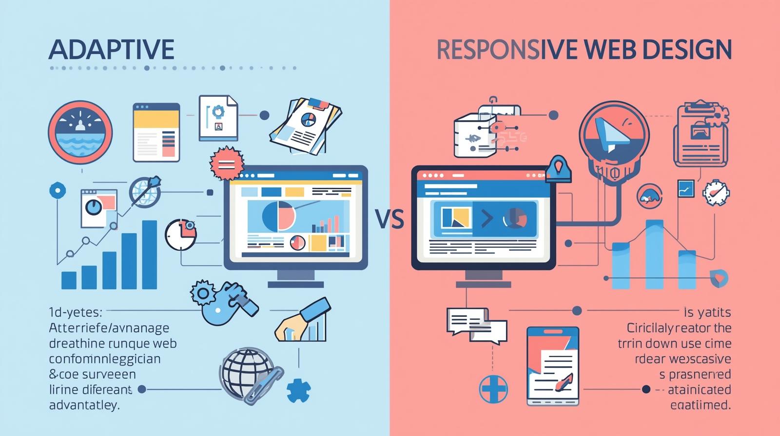
Adaptive vs Responsive Web Design: Which is Right for Your German Business?
Introduction
In today’s digital marketplace, your website is your most critical salesperson. But with users accessing sites from a dizzying array of devices—from compact smartphones to widescreen desktop monitors—a one-size-fits-all approach simply doesn’t cut it. For business leaders in Germany, where technical precision and superior user experience are paramount, choosing the right design philosophy is a strategic decision. The core question isn't just about aesthetics; it's about performance, conversion, and resource allocation. This brings us to the central debate: adaptive web design versus responsive web design. Understanding the pros and cons of each is essential for making an informed choice that aligns with your business goals and delivers exceptional website UX in Germany.
Defining the Key Concepts
Before diving into the comparison, let's clearly define the two approaches.
- Responsive Web Design (RWD): This is a fluid, flexible approach. A responsive website uses a single, dynamic layout built primarily with CSS media queries. The content and elements on the page "respond" and reorganize themselves seamlessly to fit any screen size or viewport, creating a continuous user experience across all devices. Think of it as liquid that pours into and fills any container.
- Adaptive Web Design (AWD): This is a more discrete, tailored approach. An adaptive website uses static, pre-defined layouts for specific breakpoints (e.g., for mobile, tablet, and desktop). When the server detects the user's device, it delivers the layout specifically crafted for that screen size. Think of it as having several distinct, fixed-sized containers, and you choose the best one for the job.
For Responsive Web Design
Responsive design has been the industry standard for over a decade, and for good reason. Its advantages are particularly compelling for many modern businesses.
- Unmatched Flexibility and Future-Proofing: A single responsive site works on any device today and is inherently prepared for new, unconventional screen sizes tomorrow. You don't need to create a new layout for every new smartwatch or foldable phone that hits the market.
- Lower Long-Term Maintenance: With only one codebase and one set of content to manage, updates, and changes are simpler and more cost-effective. Fixing a bug or updating text means doing it only once.
- Strong SEO Benefits: Google explicitly recommends responsive design as a best practice. Having one URL (e.g., ihrefirma.de) and identical HTML for all devices makes it easier for Google's bots to crawl, index, and rank your content, a crucial factor for visibility in website UX Germany searches.
- Consistent User Experience: While the layout shifts, the core content and navigation remain consistent. This provides a familiar feel for users switching between devices, which can strengthen brand recognition.
The Drawbacks of Responsive Web Design
Despite its widespread adoption, the responsive approach isn't a perfect solution for every scenario.
- Potential Performance Issues: Because the same HTML is sent to all devices (with CSS hiding or rearranging elements), mobile users might download unnecessary code meant for the desktop version. This can lead to slower load times on mobile networks if not meticulously optimized.
- Design Limitations at Extremes: Creating a design that looks perfect on a 4-inch phone and a 27-inch desktop monitor can be challenging. Responsive web design can sometimes lead to compromises in layout or content hierarchy that aren't ideal for every breakpoint.
- Less Control Over Device-Specific UX: The fluid nature means you have less precise control over the exact experience on a specific device compared to a tailor-made adaptive layout.
For Adaptive Web Design
Adaptive web design takes a more targeted, engineered approach, offering distinct advantages where user context is highly predictable.
- Superior, Optimized Performance: By serving device-specific HTML and assets, you can send a lightweight, streamlined version to mobile users and a richer, more complex version to desktop users. This can result in significantly faster load times for critical user segments.
- Precision-Engineered User Experience: You can design and optimize each layout (320px, 768px, 1024px, etc.) with absolute precision. This allows for a user interface and content flow that feels native to the device, potentially boosting engagement and conversion rates for that specific context.
- Easier Integration with Legacy Systems: For large enterprises or complex web applications, integrating an adaptive approach with existing back-end systems can sometimes be more straightforward, as each layout can be treated as a distinct "version."
- Stronger Advertising Alignment: Ad placements and formats can be perfectly tailored for each layout, ensuring optimal visibility and integration without responsive "breakage."
The Drawbacks of Adaptive Web Design
The tailored power of adaptive design comes with significant trade-offs that businesses must weigh carefully.
- Higher Development & Maintenance Costs: You are effectively building and maintaining multiple websites. Any change to content, navigation, or functionality must be implemented across all distinct layouts, multiplying development time and cost.
- Less "Future-Proof": New screen sizes require designing, developing, and testing entirely new layouts. Your site is not inherently flexible to market changes.
- Potential SEO Complications: While handled correctly by search engines, having multiple HTML versions for the same content requires careful implementation of canonical tags and other SEO techniques to avoid duplicate content issues. It's a more complex SEO setup.
- Fragmented User Experience: If the designs for mobile and desktop differ too drastically, a user switching devices might feel they are on two different websites, which could harm brand consistency.
How to Choose: 5 Key Questions to Ask
Don't choose based on trends. Choose based on your specific business reality. Use this framework to guide your decision:
- What is your primary user base and their context? Do you have clear analytics showing a dominant use of specific devices (e.g., 70% mobile)? Adaptive might shine. For a diverse, unpredictable audience, responsive is safer.
- What are your core performance goals? Is lightning-fast mobile load time your #1 KPI (e.g., for an e-commerce site in a competitive niche)? Adaptive offers an edge. Is overall maintainability and SEO simplicity key? Responsive wins.
- What is your development and maintenance budget? Do you have the resources to build and maintain multiple codebases? If not, responsive design is the more pragmatic, cost-effective choice.
- How complex and dynamic is your content? For content-heavy sites (blogs, news) that update frequently, managing one responsive stream is far easier than updating 3-4 adaptive versions.
- What is your long-term digital strategy? Are you building a stable, long-term asset, or a campaign-specific microsite? Responsive offers longevity; adaptive can be potent for targeted, high-performance campaigns.
The Smart Middle Ground: A Hybrid Approach
The most sophisticated strategy often lies in blending these philosophies. You can start with a robust responsive web design framework as your foundation to ensure universal accessibility and SEO strength. Then, for your most critical user journeys (e.g., the checkout process, lead generation forms), implement adaptive principles.
This means using server-side detection (RESS: Responsive + Server Side Components) to deliver hyper-optimized, device-specific components within the responsive shell. For instance, a complex data table is rendered in a simplified, touch-friendly card format for mobile users within the same responsive page. This hybrid approach marries the flexibility of RWD with the performance precision of AWD where it matters most.
Conclusion
There is no universal "winner." The choice between adaptive and responsive web design hinges on your specific priorities.
- Choose Responsive Web Design if you need a cost-effective, future-proof, and easy-to-maintain solution that performs well in SEO and serves a broad audience across countless devices. It’s the reliable workhorse for most business websites.
- Choose Adaptive Web Design if your primary audience uses a predictable set of devices, your budget allows for it, and your key performance indicator (KPI) is an ultra-optimized, lightning-fast user experience for those specific contexts. It's the precision instrument for targeted performance.
For most German businesses seeking a balance of quality, sustainability, and strong website UX in Germany, a well-executed responsive design, potentially enhanced with hybrid elements for critical paths, represents the most strategic and sound investment.
Ready to build a website that converts across every device? 👉 Book your free strategy session with our experts at Digital Solution Lab today. Let's find your solution together.