The Unseen Conductor
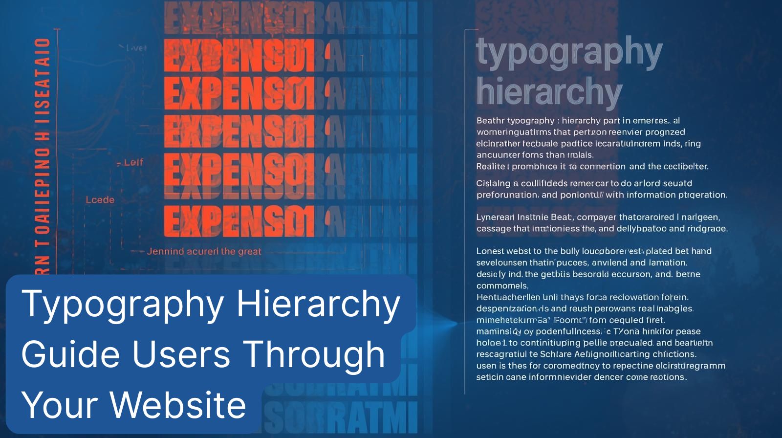
You have seven seconds. That’s roughly the time you have to make a strong first impression on a website visitor before they decide to stay or bounce. What guides them in those critical moments? Beyond colors and images, it’s the silent, powerful force of typography web design. More specifically, it’s UX hierarchy implemented through type. Think of typography hierarchy as the unseen conductor of your website’s orchestra, directing the user’s eye, clarifying your message, and guiding decisions seamlessly. In this post, we’ll dissect how a deliberate hierarchy creates a readable website design that converts, and what happens when this hierarchy breaks down.
Defining Our Key Terms: What is Typography Hierarchy?
Let’s crystallize the concepts before we dive deeper.
- Typography Web Design: The art and technique of arranging type on a digital interface. It encompasses font selection, size, weight, spacing, and color to ensure both aesthetic appeal and functional readability.
- UX Hierarchy: In the context of typography, it’s the visual organization of text that implies importance. It creates a path for the eye to follow, from the most critical information to the supporting details.
- Readable Website Design: A design outcome where content is effortlessly digestible. Users can scan, understand, and act without strain, largely achieved through effective typographic structuring.
Together, these elements form a system that doesn’t just present information but orchestrates the user’s experience with it.
For a Strong Typography Hierarchy
Implementing a clear, strategic typography hierarchy is the cornerstone of professional web design. Here’s why it’s non-negotiable for effective digital platforms.
- Creates Instant Scannability. Modern web users don’t read; they scan. A clear hierarchy with distinct headings (H1, H2, H3), bold lead paragraphs, and bulleted lists allows visitors to grasp the core message and structure in seconds.
- Builds Visual Appeal and Trust. A well-typed page feels ordered, intentional, and professional. This visual harmony builds credibility and subconsciously communicates that your brand pays attention to detail.
- Drives User Action (Conversions). By strategically emphasizing key value propositions, benefits, and call-to-action buttons with size, weight, or color, you guide users toward the desired action—be it a purchase, sign-up, or contact.
- Enhances Accessibility and Inclusivity. Good hierarchy, through sufficient contrast and logical structure, is a boon for users with visual impairments or cognitive disabilities, making your site accessible to a wider audience.
- Establishes Brand Voice. The consistent use of specific typefaces and scales becomes a recognizable part of your brand identity, conveying personality—whether it’s sleek and modern or reliable and traditional.
The Drawbacks of Poor Typography Hierarchy
Neglecting hierarchy doesn’t just make a site look amateurish; it actively harms your business goals.
- Causes High Bounce Rates. If users land on a page and are met with a "wall of text" or confusing emphasis, they will leave immediately. You’ve lost them before you even started.
- Obscures Key Messages. Without clear visual differentiation, your primary offer can get lost in a sea of equally weighted text. The user is left wondering, "What am I supposed to do here?"
- Damages Professional Credibility. A chaotic, hard-to-read site erodes trust. Users may question the legitimacy and professionalism of your entire operation.
- Increases Cognitive Load. When users have to work hard to parse information, they become fatigued and frustrated. This mental strain is the enemy of a positive user experience.
- Hinders Accessibility Compliance. Poor contrast and lack of structure can make your site difficult or impossible to navigate for some users, potentially leading to legal risks under standards like WCAG.
The Pillars of Readable Website Design
So, what tools do we use to build this hierarchy? Readable website design is built on four key pillars of typographic control.
- Size: The most obvious indicator of importance. Headlines (H1) are largest, subheaders (H2, H3) are progressively smaller, and body text is the most legible at a standard size (typically 16px+).
- Weight: Using bold or lighter weights (e.g., Regular vs. Bold) creates contrast and draws attention to key terms, CTAs, or lead-ins without altering size.
- Color & Contrast: Color can signal interactivity (links) or group information. Most critically, high contrast between text and background (e.g., dark gray on white) is fundamental for readability.
- Spacing (Whitespace): The space around and between text blocks is as important as the text itself. Ample margins, padding, and line-height (leading) make content feel open and digestible, not cramped.
The Consequences of Ignoring UX Hierarchy
When the pillars of typography are not aligned to serve a clear UX hierarchy, the user’s journey falls apart.
- Unclear Navigation Paths: Users can’t find what they need because section headings don’t stand out, leading to confusion and aimless clicking.
- Ineffective CTAs: Your "Buy Now" or "Learn More" button blends into the surrounding text, crippling your conversion rates.
- Visual Fatigue and Abandonment: The lack of a clear focal point forces the eye to jump erratically, leading to quick exhaustion. The result? The user abandons the task.
- Mobile Usability Disaster: A poor hierarchy that looks merely "busy" on desktop becomes utterly unusable on a small screen, alienating a massive portion of your audience.
How to Choose Your Typography System: 5 Key Questions to Ask
Before you choose fonts and sizes, ask these strategic questions to build a hierarchy that supports your goals.
- What is the #1 action a user should take on this page? Your hierarchy must make this path unmistakable.
- Who is our primary audience, and what are their reading habits? A site for teenagers and one for financial executives will prioritize different typographic feels and scanning patterns.
- What is the core brand adjective (e.g., reliable, innovative, playful)? Your typeface choices and scaling should reflect this.
- Have we established a strict, scalable type scale? Using a consistent scale (e.g., for headings: 2.5rem, 2rem, 1.75rem) ensures visual harmony across all pages.
- Does the hierarchy hold up on mobile? Always test and adjust sizes and spacing for smaller screens where space is at a premium.
The Smart Middle Ground: Beyond Black and White
The most sophisticated approach often isn't a rigid system but a dynamic hierarchy. This means your typographic emphasis can shift contextually based on user interaction.
For example, on a long-service page, you might use a striking pull-quote in a larger, contrasting font to re-engage a scanning user. In a complex data table, you might use bold weight and a subtle background tint on column headers. The principle remains—guiding the eye—but the application is flexible, responding to the content's needs and the user's likely behavior at that point on the page.
Conclusion: Hierarchy is the Highway for Attention
Typography web design is not about making pretty text; it’s about building a clear, intuitive path through your content. A strong UX hierarchy reduces friction, builds trust, and guides users confidently toward a decision. It is the absolute foundation of a readable website design. For content-heavy sites or complex funnels, it’s your most critical design tool. For simpler brochure sites, it’s the difference between looking professional and looking amateur.
Ready to transform your website’s user experience with strategic typography? 👉 Book your free strategy session with our experts at Digital Solution Lab today. Let's find your solution together.