Your website's design is a critical business asset, but common web design mistakes directly impact your revenue. These UX errors—like slow loading times and confusing navigation—create a poor user experience and drive potential customers away. This breakdown moves beyond aesthetics to explore the core flaws that constitute bad design, comparing design-first and UX-first approaches. We provide a clear framework to audit your site, helping you eliminate these costly errors and build a website that converts visitors into customers.
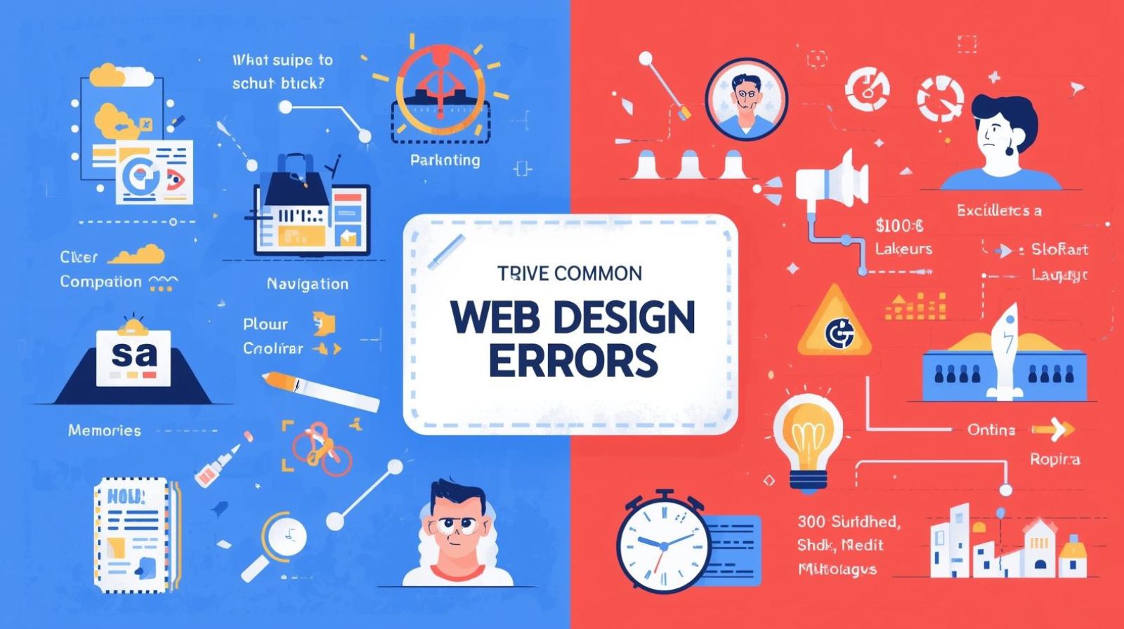
Your website is your digital storefront, working 24/7 to generate leads and sales. But what if it's secretly sabotaging your business? Many companies invest heavily in driving traffic to their sites, only to see potential customers bounce away due to preventable web design mistakes. These errors create a poor user experience, damage your credibility, and directly impact your bottom line. In this article, we'll move beyond surface-level aesthetics and delve into the core UX errors and structural flaws that constitute bad design. We'll compare two fundamental approaches to web design, providing you with a clear framework to audit and fix your own site.
Before we diagnose the issues, let's define our terms. When we talk about web design mistakes, we're not just referring to an outdated color scheme.
Many businesses, especially creative agencies and consumer brands, prioritize a "design-first" philosophy. This approach focuses heavily on visual impact and brand storytelling.
While beautiful design is valuable, an overemphasis on aesthetics can backfire, leading to some of the most common UX errors.
The "UX-first" approach flips the script. It starts not with how the site looks, but with how it works. The primary goal is to make the user's journey as seamless and efficient as possible.
A purely utilitarian focus also has its potential pitfalls, which can sometimes manifest as its own form of bad design.
You don't have to choose one approach exclusively. The key is to find the right balance. Ask yourself these questions to identify your most critical web design mistakes.
The most effective modern websites don't choose between design and UX—they marry them. This hybrid approach starts with a deep understanding of the user (UX) and then expresses that understanding through a compelling visual identity (Design).
Think of it as "UX as the foundation, and Design as the facade." You build a solid, logical, and efficient structure first. Then, you apply a beautiful, on-brand, and emotionally resonant layer on top of it. A beautiful animation is only used if it doesn't slow down the site. A unique navigation is only implemented if user testing confirms it's intuitive. This strategy systematically eliminates web design mistakes by ensuring every aesthetic choice serves a functional purpose.
Ultimately, bad design is design that fails the user. While a beautiful website is desirable, it must be built on a foundation of flawless functionality. The UX errors that cause slow load times, confusing navigation, and unclear messaging are the ones that truly hurt your business. By adopting a user-centric, hybrid approach, you can create a site that is both visually appealing and a powerful business tool. A design-first approach is best for brands where visual identity is the primary differentiator, while a UX-first approach is critical for sites where conversion and efficiency are paramount. For everyone else, the hybrid model offers the best path to success.

1/16/2026
1/16/2026

1/16/2026

1/16/2026
1/15/2026
Charlottenburg District Court; HRB 273096 B; Tax ID: 29/262/32902
Managing Director: Adil Sunil | Berlin, Germany
🇩🇪 GDPR Compliant
🔒 SSL Encrypted
⚡ Carbon Neutral Hosting