Introduction
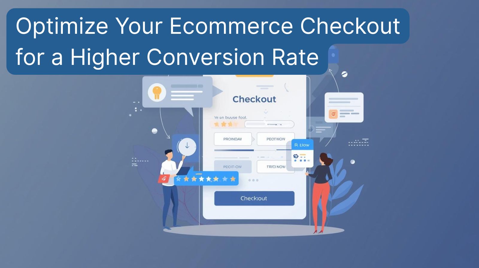
You've done the hard work. A customer has found your store, browsed your products, and filled their cart. They're one step away from becoming a paying customer. Then, they vanish. This scenario, known as cart abandonment, is a multi-billion dollar problem for online businesses. The culprit is often a poorly designed checkout process. The final hurdle is where many races are lost. But what's the best way to design it? Should you strip it down to the bare essentials or provide a feature-rich experience? Let's dissect the two dominant philosophies in UX optimization to help you reclaim those lost sales.
Defining the Checkout Battle: Streamlined vs. Guided
Before we dive in, let's clarify the two core approaches to the ecommerce checkout experience.
- The Streamlined Checkout: This approach is minimalist. Its sole purpose is to get the customer from cart to confirmation in as few steps and with as few clicks as possible. Think of it as a single, frictionless page.
- The Guided Checkout: This is a more involved, multi-step process. It holds the customer's hand, offering reassurance, additional information, and upsell opportunities along the way. It prioritizes clarity and confidence over pure speed.
For a Streamlined Checkout
The primary argument for a minimalist checkout is simple: reduce friction to boost your conversion rate.
- Speed is King: In our fast-paced world, customers appreciate speed. A one-page checkout drastically reduces the time to completion, which directly addresses impatience and reduces the chance of distraction.
- Fewer Abandonment Points: Every new page or step is a potential exit point. By consolidating the entire process into a single view, you eliminate these intermediate drop-off points.
- Mobile-First Excellence: On a small screen, a long, multi-step process can feel endless. A streamlined checkout is inherently more mobile-friendly, providing a smoother experience for the growing number of mobile shoppers.
- Simplicity Reduces Anxiety: A cluttered page with too many options can overwhelm users. A clean, focused form feels more manageable and less intimidating.
The Drawbacks of a Streamlined Checkout
While fast, the ultra-minimalist approach isn't without its trade-offs.
- Limited Flexibility: It struggles with complex orders. If you need to offer multiple shipping options, gift wrapping, or other customizations, a single page can become crowded and confusing.
- Missed Revenue Opportunities: There's no natural place for cross-selling or upselling complementary products. You're trading potential add-on revenue for pure conversion speed.
- Lack of Reassurance: For first-time customers or high-value purchases, a single page might feel insubstantial. It can lack the space to display trust signals, return policies, or security badges prominently throughout the process.
For a Guided Checkout
A guided, multi-step checkout focuses on building customer confidence and maximizing value.
- Manages Complexity Beautifully: By breaking a complex process into simple, logical steps (e.g., Shipping -> Payment -> Review), you make it feel less daunting. This is ideal for stores with custom products or multiple delivery options.
- Perfect for Upselling: The step-by-step nature creates natural pauses where you can suggest relevant products. "Customers who bought this also added..." between the cart and payment step can be highly effective.
- Builds Trust and Confidence: Each step provides real estate to reinforce security. You can display logos, guarantees, and support contact information throughout the journey, reassuring customers at every click.
- Clear Progress Indication: A progress bar (Step 1 of 3) is a powerful psychological tool. It sets expectations, shows the customer how far they've come, and how little is left, which encourages completion.
The Drawbacks of a Guided Checkout
The main risk of a guided checkout is that it can backfire and create the very friction you're trying to avoid.
- The Peril of Friction: Every "Continue" or "Next Step" button is a point of friction. If the process feels too long, customers may get frustrated and abandon their cart.
- Forced Account Creation: If a guided flow forces users to create an account early on, it can be a major conversion killer. Many shoppers prefer to checkout as a guest.
- Mobile Unfriendliness: On mobile, scrolling through multiple steps can feel tedious and interrupt the flow of the purchase, leading to higher abandonment rates on smaller screens.
How to Choose: 5 Key Questions to Ask
Your ideal checkout strategy depends entirely on your business. Ask yourself these questions:
- What is my average order value? High-ticket items often benefit from the reassurance of a guided flow, while low-cost, impulse buys need speed.
- How complex are my products/services? Do you offer multiple shipping speeds, customization, or installations? Complexity often necessitates a guided approach.
- Who is my target audience? Are they tech-savvy millennials who value speed, or a less digital-native audience that appreciates more guidance?
- What is my primary goal? Is it purely to maximize the conversion rate, or is increasing the average order value through upsells equally important?
- What does my data say? Use analytics and session recordings to see where in your current checkout process people are dropping off.
The Smart Middle Ground: The Optimized Hybrid Approach
The most effective modern ecommerce checkout isn't strictly one or the other. It's a hybrid that borrows the best from both worlds. Here’s how it works:
- Implement a Single-Page Layout with Accordion Steps. The customer sees all steps on one page (Streamlined), but they are collapsed into sections like "Shipping," "Payment," and "Review" (Guided). They can see the whole process at a glance but focus on one field at a time. This combines the speed of a single page with the managed complexity of steps.
- Offer Guest Checkout as the Default. Never force account creation. Instead, offer it as an easy option after the purchase is complete.
- Use a Dynamic Progress Bar. Even on a single page, a visual progress bar provides the psychological benefits of a guided flow.
- Place Strategic, Unobtrusive Trust Signals. Place security badges and guarantees next to the payment section and in the page footer for reassurance without clutter.
Conclusion
There is no one-size-fits-all answer. For simple, low-cost products and an audience that values speed above all, a streamlined checkout is often the winner. For complex, high-value products where trust and guidance are paramount, a well-designed guided flow is superior. However, the ultimate goal of UX optimization is to create a seamless, intuitive, and fast experience regardless of the structure. The hybrid model, which leverages the strengths of both, is frequently the most robust path to a higher conversion rate.
CTA: Ready to transform your checkout and boost sales? 👉 Book your free strategy session with our experts at Digital Solution Lab today. Let's find your solution together.