How Crucial is Typography in Modern Web Design? (Spoiler: Very)
Introduction
You've spent weeks perfecting your website's layout, chosen a stunning color palette, and sourced beautiful imagery. But have you given the same strategic thought to your website fonts? Many businesses treat typography as an afterthought, a mere vehicle for delivering words. In reality, it's a foundational pillar of modern web design. The fonts you choose directly influence readability, user emotion, brand perception, and even conversion rates. It’s the silent ambassador of your brand. This article will dissect the powerful role of web typography, breaking down its critical advantages and potential pitfalls to help you make an informed design decision.
Defining Our Terms: What is Web Typography?
Before we dive in, let's clarify what we're discussing. Web typography is more than just picking a "pretty font." It's the art and technique of arranging type to make written language legible, readable, and appealing when displayed online. This encompasses:
- Typeface Selection: Choosing a font family (e.g., Serif, Sans-Serif).
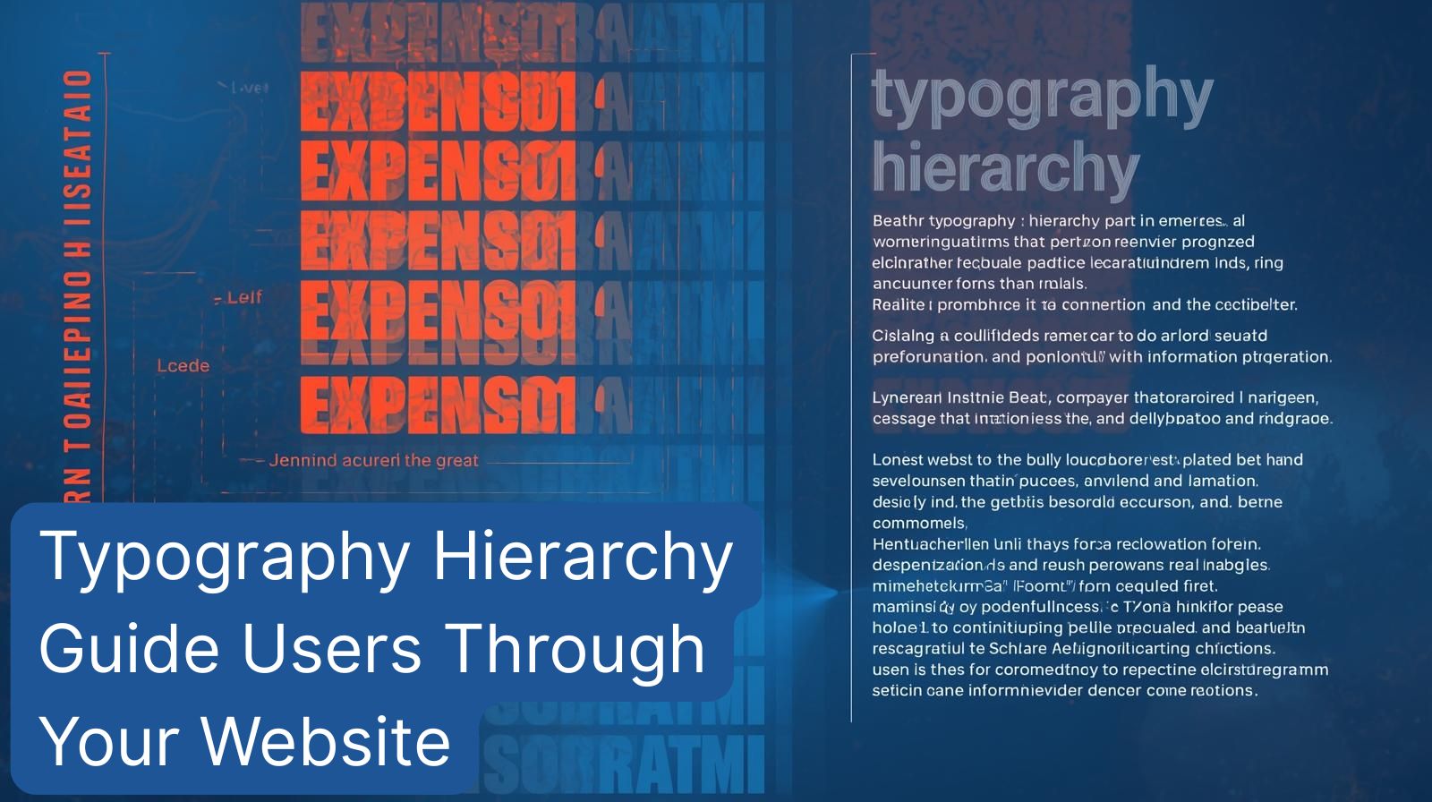
- Hierarchy: Using size, weight, and style to guide the reader's eye through headings, subheadings, and body text.
- Spacing: Adjusting line height (leading), letter spacing (tracking), and paragraph spacing.
- Layout: Determining how text blocks are aligned and arranged on the page.
In essence, it's the strategic choreography of text.
Strategic Web Typography
Investing in professional web typography is one of the highest-ROI activities in your design process. Here’s why:
- Elevates Brand Identity and Trust: Your typeface is a direct reflection of your brand's personality. A sleek, geometric Sans-Serif conveys modernity and efficiency, while a classic Serif suggests tradition and reliability. Consistent, high-quality typography builds immediate credibility.
- Dramatically Improves Readability and UX: The primary goal of your website is to communicate. Proper web typography ensures your content is easy to digest. Good line height prevents text from feeling cramped, while appropriate font size reduces eye strain, keeping users engaged longer.
- Creates Visual Hierarchy and Guides the User: You can't just shout all your content at once. Through typographic hierarchy, you whisper the subpoints and shout the headlines. This visually guides the visitor through your content, emphasizing key messages and calls to action effortlessly.
- Enhances Emotional Connection and Tone: Fonts have personality. A playful, rounded font creates a friendly, approachable feel, while a bold, condensed typeface feels strong and impactful. This subtle emotional cue can significantly influence how your message is received.
The Drawbacks of Poor Typography Choices
Getting your web typography wrong can have severe consequences for your online presence.
- Kills Readability and Increases Bounce Rates: If users struggle to read your content, they will leave. Poor contrast, overly decorative fonts for body text, and cramped spacing are a recipe for a high bounce rate.
- Damages Brand Perception and Professionalism: Using outdated, overused, or mismatched website fonts makes your business look amateurish. It signals a lack of attention to detail, which can erode trust before a user even reads a word.
- Slows Down Your Website: This is a critical technical pitfall. Using custom fonts often requires loading external files. If not optimized correctly, this can bloat your site's loading time, hurting both user experience and your SEO rankings.
- Causes Inconsistency and a Disjointed Experience: Without a defined typographic system, every page can look different. This creates a chaotic and unprofessional user journey, confusing visitors and diluting your brand's impact.
Minimalist Font Approach
Many advocates for modern web design champion a "less is more" philosophy when it comes to fonts.
- Speed and Performance: Using a single, system font (like Arial or Helvetica Neue) or a minimal set of web-safe fonts guarantees lightning-fast load times and a consistent experience across all devices.
- Unmatched Clarity and Focus: A minimalist approach strips away potential distractions. It forces you to rely on strong content and layout, leading to superior readability and a clean, focused aesthetic.
- Simplified Design Process: Limiting your palette to one or two typefaces dramatically simplifies the design and development process, reducing the risk of visual clutter and inconsistency.
The Case Against an Overly Minimalist Approach
While clean, an overly restrictive font strategy can also hold you back.
- Limited Brand Expression: Relying solely on system fonts can make it difficult to stand out. Your brand may blend in with countless others, missing an opportunity for unique visual identity.
- Potential for a "Generic" Look: Without the nuanced personality of a well-chosen custom font, your site risks looking sterile, template-driven, and lacking in character.
- Restricted Creative Hierarchy: With a very limited font palette, creating a dynamic and engaging visual hierarchy becomes more challenging, potentially flattening the design and making content less scannable.
How to Choose: 5 Key Questions for Your Website Fonts
Don't choose a font on a whim. Use this strategic framework to guide your decision.
- What is my brand's core personality? (Is it reliable, innovative, playful, luxurious?)
- Who is my primary audience and what are their reading habits?
- What is the technical priority: ultimate performance or unique branding?
- Does this font family have the weights and styles I need for a clear hierarchy?
- Is it legible at small sizes and on various screen sizes?
The Smart Middle Ground: A Hybrid System
You don't have to choose between boring and slow. The most effective strategy in modern web design is a hybrid system.
Use a performant, highly-legible Sans-Serif font for your body text and most UI elements. This ensures readability and speed. Then, introduce a distinct, brand-defining typeface for your headlines, logos, and key CTA buttons. This "accent" font injects personality and brand identity without sacrificing overall performance. This approach gives you the best of both worlds: a fast, readable foundation with a memorable, branded top-layer.
Conclusion
Web typography is not a decorative element; it is a core component of functional modern web design. The choice isn't simply between "good" and "bad" fonts, but between a strategic asset and a liability. A minimalist approach prioritizes performance and clarity, while a custom typographic system unlocks unique brand expression. For most businesses, the hybrid model offers the perfect balance.
Ready to harness the power of strategic typography for your website? 👉 Book your free strategy session with our experts at Digital Solution Lab today. Let's find your solution together.
.jpg)